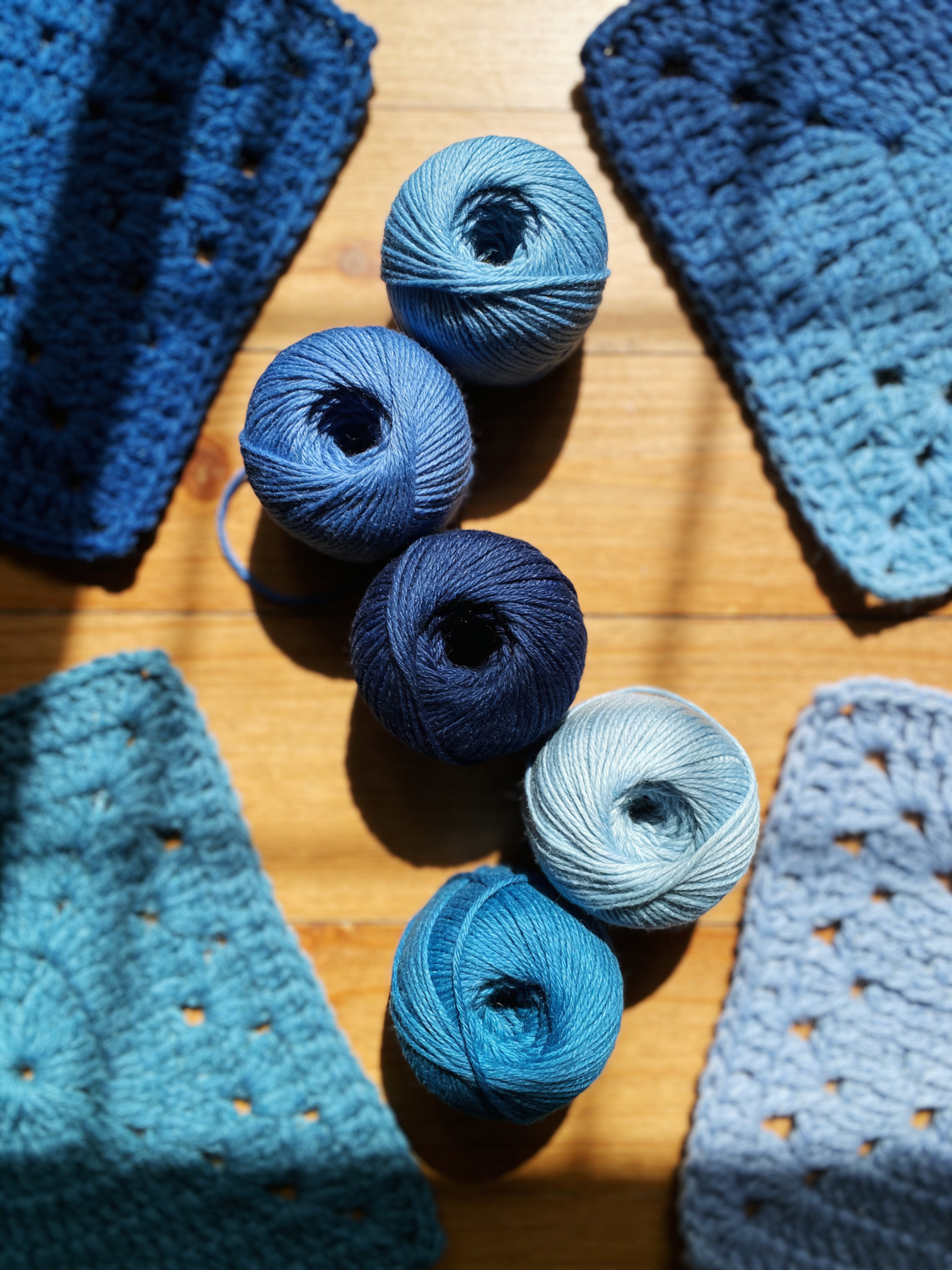
An ocean blue color palette brings the calming energy of the coast into your crochet projects. From deep navy to pale sky, these water-inspired hues create pieces that feel fresh, airy, and endlessly wearable. Whether you live by the beach or simply love coastal aesthetics, these six yarn combinations capture seaside serenity.
The Psychology of Ocean Colors
Blue is universally loved—studies show it’s the world’s favorite color. An ocean blue color palette triggers relaxation responses, lowers blood pressure, and evokes feelings of openness and possibility. These aren’t just pretty colors; they’re therapeutic tools for creating calming spaces and wearable comfort.
1. Deep Sea and Foam
Combine navy blue with pale seafoam for dramatic contrast. This classic ocean blue color palette pairing works for nautical-themed blankets, striped sweaters, and beach bags. The dark navy grounds the ethereal foam white, creating sophisticated pieces that feel both coastal and polished.
2. Turquoise and Sand
Pair vibrant turquoise with warm beige for tropical flair. This bright ocean blue color palette evokes Caribbean waters and sunny beaches. Perfect for summer accessories, lightweight shawls, and vacation-inspired home decor. Add touches of coral for extra tropical energy.
3. Denim and Sky
Mix medium blue-grey with pale powder blue for subtle serenity. This gentle ocean blue color palette suits everyday pieces you’ll wear constantly. The low contrast creates calming visual flow perfect for baby blankets, casual scarves, and minimalist throws.
4. Gradient Ocean
Use five shades ranging from midnight blue through royal to pale aqua. This ombré ocean blue color palette mimics the changing depths of seawater. Create stunning gradient blankets, ocean-wave shawls, or color-pooling accessories that showcase the transition.
5. Stormy Seas
Combine slate blue, silver grey, and white for dramatic coastal weather vibes. This moody ocean blue color palette feels sophisticated and contemporary. Ideal for modern home decor, textured cushions, and statement winter accessories.
6. Tropical Lagoon
Blend teal, aqua, and sea green with touches of white. This vibrant ocean blue color palette captures shallow tropical waters. Perfect for summer tops, beach cover-ups, and bright bathroom accessories that bring vacation energy home.
Coastal Project Ideas
Your ocean blue color palette excels in nautical-striped blankets, seashell-inspired doilies, beach totes with rope handles, anchor-motif pillows, and gradient shawls that flow like waves. These colors work year-round but shine brightest in spring and summer projects.
Texture Techniques for Ocean Projects
Enhance your ocean blue color palette with appropriate stitches. Try wave patterns, shell stitches, bobble textures for bubbles, and mesh patterns for fishing net effects. The right texture makes ocean colors feel authentic rather than merely blue.
Frequently Asked Questions
Can I use ocean colors in winter projects?
Absolutely! An ocean blue color palette transcends seasons. Choose deeper navy and slate tones for winter warmth. Ocean themes work year-round, especially in cozy blanket form.
What skin tones suit ocean blue best?
The beauty of an ocean blue color palette is universal flattery. Deep navy suits everyone. Lighter blues complement cooler skin tones, while turquoise enhances warmer complexions. Mix shades for pieces anyone can wear.
How do I prevent ocean colors from looking too “themed”?
Subtlety is key. Use your ocean blue color palette in modern geometric patterns rather than literal sea motifs. Color blocking, stripes, and gradients feel contemporary rather than kitschy.