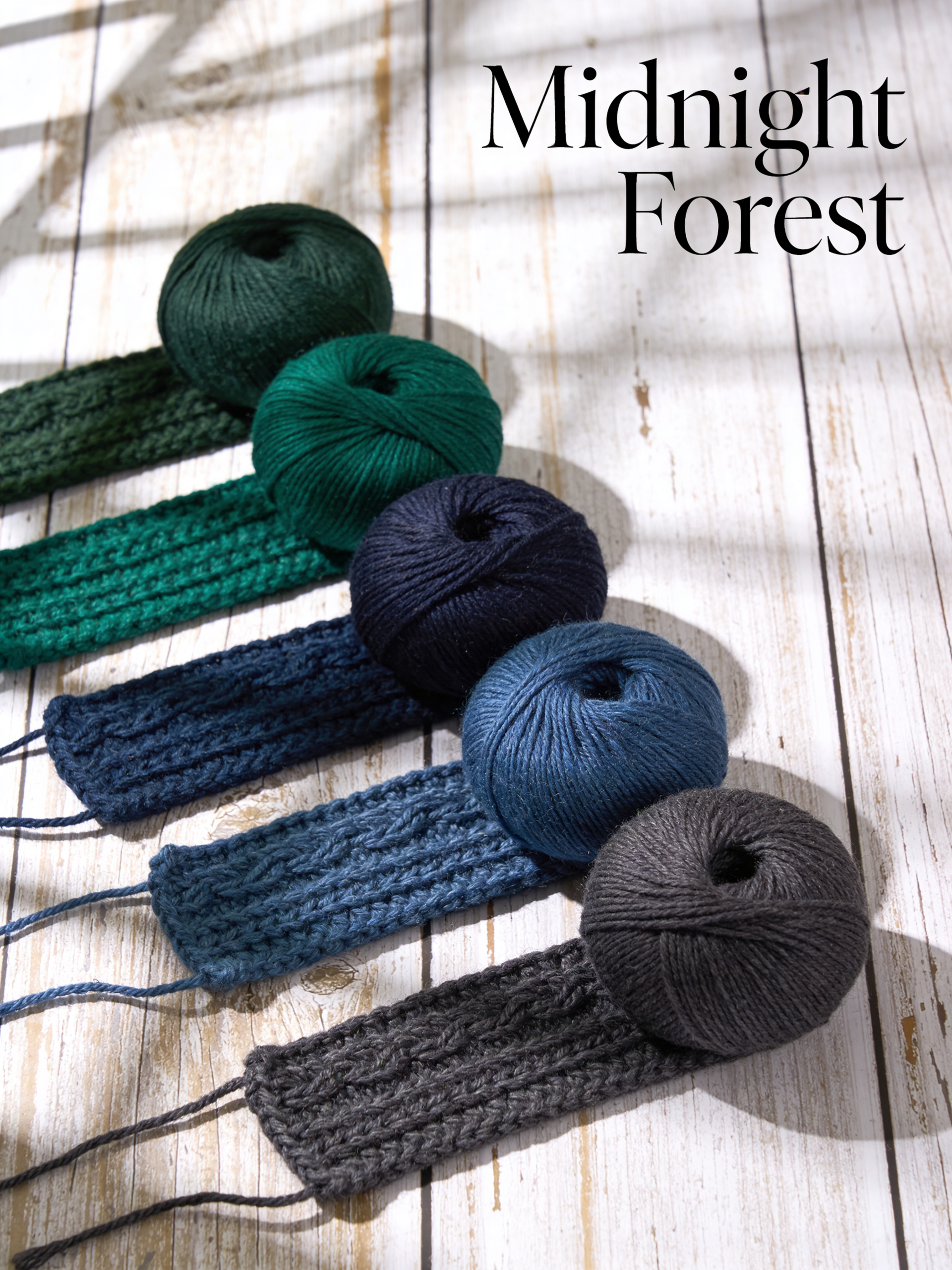
Dark green yarn colors bring the mystery and comfort of deep forests into your crochet. From hunter green to forest pine, these rich shades create pieces that feel both grounding and luxurious. Whether you’re crafting winter accessories, nature-inspired home decor, or year-round staples, these five midnight forest shades add sophistication to every project.
The Power of Dark Green
Green represents growth, renewal, and connection to nature. Dark green yarn colors specifically evoke old growth forests, winter evergreens, and traditional elegance. These shades are surprisingly versatile—masculine yet soft, seasonal yet timeless, bold yet sophisticated. They work in every project category.
1. Hunter Green
The classic dark green yarn color—deep, rich, and slightly blue-tinged. Hunter green is the workhorse of forest palettes. It pairs beautifully with cream for traditional looks, burgundy for Christmas projects, and gold for luxe autumn pieces. Use it as your primary color or as a grounding neutral.
2. Forest Pine
Capture the essence of evergreen trees with this slightly lighter dark green yarn color. Forest pine has yellow undertones that warm up any project. Perfect for nature-themed blankets, woodland nursery items, and cozy winter accessories that feel like a walk through the woods.
3. Emerald Depth
Add jewel-tone luxury with rich emerald. This glamorous dark green yarn color elevates simple patterns into statement pieces. Pair with gold accents for Art Deco vibes, or with grey for modern sophistication. Emerald makes excellent shawls, statement scarves, and holiday decor.
4. Olive Mystery
This brown-tinged dark green yarn color adds earthy warmth and vintage appeal. Olive green feels less “Christmas” and more year-round wearable. It pairs beautifully with mustard, rust, and cream for autumn palettes. Use olive when you want green’s grounding without its formality.
5. Midnight Teal
Blur the line between green and blue with this mysterious dark green yarn color. Midnight teal captures deep ocean and dark forest simultaneously. It’s modern, sophisticated, and unexpectedly versatile. Pair with copper for industrial chic, or with blush for contemporary romance.
Color Combinations That Work
Your dark green yarn colors need the right companions. Try hunter green with cream and burgundy for traditional elegance. Combine forest pine with mustard and brown for woodland vibes. Mix emerald with gold and charcoal for luxury. Pair olive with rust and cream for vintage warmth. Blend midnight teal with copper and grey for modern edge.
Projects Perfect for Dark Green
These dark green yarn colors excel in cable-knit blankets that showcase texture, woodland animal amigurumi, Christmas stockings and ornaments, masculine scarves and beanies, nature-inspired cushion covers, and winter accessories that feel like forest walks. Dark green also makes excellent backgrounds for colorful appliqué.
Seasonal Versatility
While dark green yarn colors shine in autumn and winter, they work year-round. Choose lighter-weight yarns and open stitches for spring and summer projects. Dark green tank tops, market bags, and lightweight shawls feel fresh in cotton or linen blends during warmer months.
Frequently Asked Questions
Does dark green make good gifts?
Absolutely! Dark green yarn colors are universally flattering and gender-neutral. Unlike bright colors that suit specific tastes, forest shades please nearly everyone. They’re especially good for recipients whose style you don’t know well.
What stitches work best with dark green?
Texture shows beautifully in dark green yarn colors. Try cables, bobbles, popcorn stitches, and post stitches. Solid stitches like moss stitch and seed stitch create interesting surfaces. Avoid overly complex lace—dark colors obscure delicate patterns.
How do I keep dark green from looking drab?
Brighten your dark green yarn colors with the right companions. Cream prevents heaviness. Gold adds warmth. Even small touches of bright colors—red berries, yellow accents—keep forest palettes lively.